4 Game-Changing YouTube Channel Setup Tips Every Creator Needs
Let’s set the record straight from the start: you can choose not to worry about thumbnails, skip coming up with video titles, and wait until retirement for some random chance to make one of your videos blow up.
And of course, no one forbids you from designing your channel however you like, on intuition—using still frames from your videos as thumbnails, or stuffing your titles with emojis and keywords.
Just remember: the lucky few who manage to get popular with such an approach make up less than one percent of all YouTubers. You only think that people don’t put in much effort and still get millions of views.
The reality is, first, you don’t see the real work behind successful videos. And second, you only notice a handful of creators who “made it” while ignoring the thousands of channels that never gain popularity.
Think bigger: success is, in most cases, the result of consistent work on both content and the channel itself.
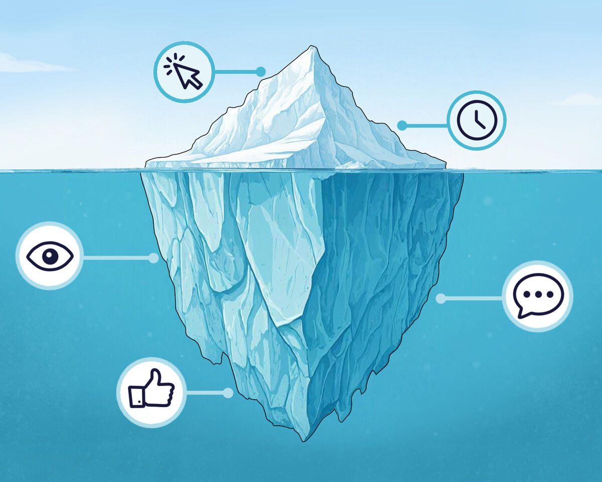
And video design makes up 50% of that success.
We’re not going to go into quality, thumbnail formats, or how to use viewer psychology to spark curiosity and make people want to click on your video.
What we do want is to draw your attention to some common mistakes that may still be hurting your stats—without you even realizing it.
First —
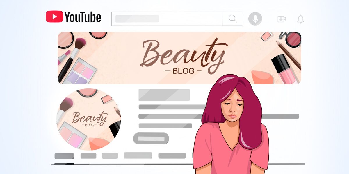
You make boring thumbnails
YouTube’s recommendations are filled with a variety of topics and formats, and every content creator faces the same challenge: standing out and catching the viewer’s attention.
And if your thumbnail looks like it was made “half-heartedly,” it will definitely be hard to stand out next to professional work.
Secondly, sometimes the problem isn’t even the complexity of the thumbnail, but rather that—
A certain trend in design can make yours look faceless and uncompetitive
What do we mean by this?
If your entire niche is filled with the same type of visuals—already claimed by creators with millions of subscribers—then it becomes very hard to stand out with that exact same design.
Look for inspiration in other niches, analyze what kind of design would help you stand out from the rest, adopt trendy elements when they’re fresh, and step away from them as soon as they become overused.
And don’t forget: your thumbnails and titles still need to be engaging.
Third—and this is our personal favorite—
You overuse clickbait and fail to meet viewers’ expectations
If your thumbnail claims that you’ll teach someone programming in 5 minutes, but the video actually lasts an hour, then it seems you’ve stretched the truth a bit.
Exaggerations like this will cost you viewers’ trust, your reputation, and your chances for long-term growth and monetization. Do we really need that kind of “help”? Hardly.
If you keep making promises to your audience and then fail to deliver, no one will want to stick with you for the long run. You might get viral videos and views on a few uploads, but a loyal audience—the key to growth—simply won’t form.
And fourth —
Stop slapping your channel name onto thumbnails and logos
It’s not aesthetic, it takes up space that could be used for something truly useful, and, frankly, it’s just silly—your channel name is already in the title, and your logo can go on your channel avatar.
A personal brand isn’t built by copy-pasting your logo everywhere.
To be memorable, you need to create engaging content and emphasize it with a unique style—both in your thumbnails and in your editing. You also need to develop your persona within your content to stand out among other creators.
In short, your design should grab attention among other videos, stop viewers’ eyes, and motivate them to watch the video all the way through. Every element of your design must serve that purpose—it shouldn’t exist just for the sake of existing.
Mistakes at this stage lead to people leaving before they even get to your content. So think about it—maybe this is the stage where you should put in a little extra effort?