The Secret Formula Behind a YouTube Layout
 Let’s say this situation: you’re preparing to publish a new video. You did everything right — chose a topic, matched the video to the right audience, filmed, edited, and finally uploaded it — yet views still don’t come. And it keeps happening over and over.
So let’s assess how appealing your videos really are: the thumbnail is a dull Photoshop screenshot, the title is a bland “How to Design a Logo”… and that’s it?
In that case, it’s no wonder your video isn’t being watched.
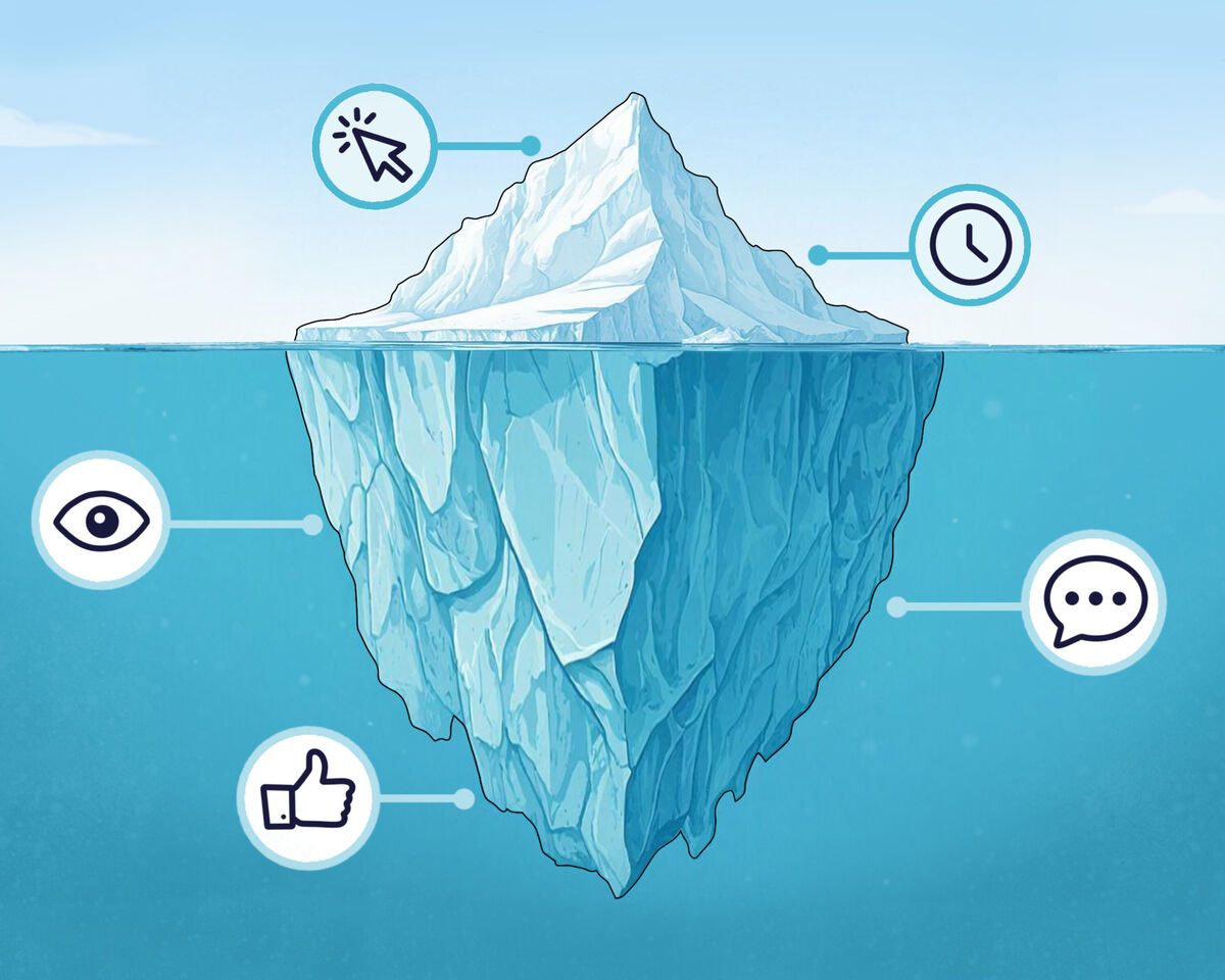
We’ve said it many times: the thumbnail and title are the first things a viewer sees, which means they account for a full 50% of your video’s success, because it’s at this stage that the decision is made — to click or not to click.
And if your design doesn’t spark interest, intrigue, a question, or even the tiniest urge to click — that’s it. The viewer won’t even reach the video itself.
Remember this once and for all: the thumbnail and title work together toward a single goal — getting the viewer to click. The thumbnail grabs attention and stops the scroll, while the title reveals the topic and sparks curiosity in the viewer’s mind.
You can’t create them separately or just “however it turns out.” The thumbnail and title form a single story that continues inside the video itself.
YouTube gives even brand-new channels a chance, and your video will get some impressions. What happens next depends entirely on you and how you use those impressions.
But let’s be honest: most people don’t click because you didn’t give them a single reason to do so.
You write video titles like:
-
"How to Design a Logo" — there are millions of videos like this;
-
"Photoshop Thumbnail Design" — boring;
-
"My Journey in Design" — who are you? Why should the viewer care?
All of these are just video topic titles, not reasons for someone to actually watch.
So how should you title a video to make viewers want to watch it all the way through?
The title should:
- First, grab attention: the title should motivate the viewer to stop and think, "Oh, this is about me!"
For example: "Why Your Logos Look Cheap (and How to Fix It)"
- Second, provoke: that is, challenge, spark debate, or stir a reaction.
For example: "This Photoshop Trick Makes You an Amateur (Even If You Try)"
- Third, promise a result: make it clear that the viewer won’t waste their time and will gain something valuable from watching.
For example: "3 Tricks to Improve Your Design in 10 Minutes"
- Fourth, evoke emotion: surprise, amuse, scare, or shock — choose the feeling you want the viewer to experience.
For example: "I Submitted a Project and Got… a Court Summons"
Sounds alarming, doesn’t it?
- And finally — spark curiosity: leave a question in the viewer’s mind that they’ll want to answer by watching the entire video.
For example: "What’s Wrong with This Logo? 90% of Designers Don’t Notice"
Every title includes conflict, an unexpected twist, a promise, or some shocking element. It’s not just “what’s in the video,” it’s why the viewer should watch the entire video.
Seems not too difficult, right? Tweak a bit here, think a bit there, and voilà — a great video title is ready.
But that’s not all — now let’s move on to the thumbnail.
Here it’s simple: if the thumbnail isn’t clear, the viewer will just scroll it.
The most common mistakes creators make are:
-
Using simple still frames from the video: sorry, but if you’re too lazy to put effort in, viewers will be too lazy to watch;
-
Overloading elements: tons of text in different sizes, hundreds of details, no focus — just chaotic clutter;
-
Lack of meaning: the image might look okay overall, but it still doesn’t grab attention because it simply doesn’t stand out — boring text, a face with no emotion, and a background that just exists.
Remember: using three elements on a thumbnail — background, text, and a face or object — is the most effective format, but simply placing them on the image isn’t enough.
Do you remember the thumbnail’s main goal? To stop the viewer’s gaze.
Therefore, a thumbnail should include:
- Eye-catching, bold text
Ideally, the story of your thumbnail should be clear without words, but if you add text, remember it shouldn’t repeat your title — it should be a separate, short, punchy phrase.
- A story or emotion
For example:
Looking at this thumbnail from MrBeast’s channel, do you understand what’s happening to him?
There are no words on his thumbnail — just different actions.
Of course, not everyone has a channel like MrBeast, so your stories can be simpler. However, the technique he uses here is called “the moment just before.”
It shows something scary, exciting, or unusual about to happen, but the viewer only finds out if they click.
There are also other formats for storytelling in thumbnails.
✔️ For example, a simple “before/after” contrast or a situation hinting at a result. We immediately understand something has changed and want to know what and how.
✔️ Confrontation: showing tension between two elements — people, objects, or even ideas. Conflict always creates intrigue. We want to know who will win and how.
✔️ Expectation vs. reality: what you wanted versus what you got, or what everyone thinks versus the truth.
This works through surprise, recognition, and self-irony. Viewers enjoy realizing they’re not the only ones who didn’t know the truth or always thought differently.
✔️ Mystery or question: a thumbnail where something seems off.
Sometimes it’s a direct question — you immediately understand the video’s topic and the story around it. Other times, it’s just an unsettling image that creates a sense of anxiety or a silent question: what’s actually happening here?
Of course, this isn’t always about horror or true crime — the mystery can be simpler.
For example, a thumbnail might show something unclear, with text like “Nobody Talks About This” or something similar.
Then the subconscious question, “What is it that nobody is telling us?” motivates viewers to click and watch the video.
Let’s recap: here’s what a thumbnail needs to show to be clickable:
-
Eye-catching, bold text
-
A story or emotion — ideally both
-
And finally: your thumbnail should stand out from the rest
This doesn’t mean your thumbnail has to be blindingly bright. Rather, it should look unique compared to most other thumbnails on similar videos.
In the gaming niche, a flashy thumbnail might not surprise anyone, so sometimes you need to take an unconventional approach — for example, just use a simple in-game screenshot without tons of effects.
Of course, the thumbnail should reinforce what you promise in the title: if you promise “10 Ways to Design a Logo,” the thumbnail should feature the 10 best logos.
However, it’s important not to slip into clickbait, or you’ll get lots of clicks but very low retention. Promises alone aren’t enough — you also need to deliver on them.
So, dear creators, how you design your video isn’t just a “picture and caption.” It determines the fate of the entire video: whether anyone will watch it at all, and whether YouTube will show it to a wider audience.